
Healthcare Office Art: Soothing Palettes for Patient Calm
A healthcare office is more than a schedule and a set of rooms. It is a place where people arrive with questions and a need to feel settled. The space cannot replace clinical work, but it can shape how patients experience the wait, the walk, and the first conversation at the desk. Thoughtful Wall Art, especially well-planned Canvas Print and Art Print choices, can help patient-facing areas feel steady, clean, and well-organized.
This guide explains how to build soothing color palettes for Office Wall Art, how to choose styles that fit healthcare settings, and where to hang Canvas Art so it supports comfort from the lobby to the hallway to private offices. The goal is simple: reduce visual noise, keep the look consistent, and create a calm rhythm across the space.
First impressions in the lobby and reception area
Before a patient speaks with staff, the room has already communicated a message. A crowded wall can feel restless, while one clear focal piece can feel planned and controlled. In many practices, the best approach is not to fill every surface, but to choose one focal Artwork piece for the reception area and keep the rest of the walls quieter.
How color and visual rhythm can support a quieter atmosphere
Color and composition shape how a room is read in seconds. In healthcare spaces, fast impressions matter because waiting can already feel long. Soothing palettes often rely on low contrast, soft edges, and repeated tones. The aim is not to create a bold feature wall, but to guide attention smoothly and keep the environment consistent.
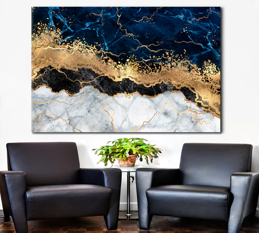
The Basics of a Soothing Color Palette
Low-contrast color families vs. high-contrast “busy” walls
Low-contrast palettes use tones that sit close together in value, such as soft blue with light gray, or warm beige with cream. When contrast is gentle, the eye moves more slowly and the wall feels less demanding. High-contrast combinations, sharp lines, and dense detail can pull attention in many directions at once, which is rarely helpful in a reception area or waiting room.
Warm vs. cool tones and when each is appropriate
Cool tones such as gentle blues and greens often read as clean and steady, while warm neutrals can feel softer. Many healthcare offices do well with a blend: a cool base for order and clarity, then a warm neutral to soften the room. If your walls are already white or gray, warmth can come from sandy neutrals, muted taupe, or soft tan in a Canvas or Wall Print.
Neutrals are the “bridge” that keeps a space feeling steady
Neutrals connect rooms with different purposes, such as a lobby, hallway, and private office. When neutral tones repeat across the suite, you can vary subjects slightly without making the building feel disconnected. Neutrals also make it easier to refresh Wall Decor later while keeping the overall mood consistent.
Palette Ideas That Work Well in Clinics and Hospital Offices
A calm plan often begins with one main palette and one supporting palette. Keep dominant colors limited so corridors, reception areas, and offices feel related, even if each room has different furniture or lighting.
- Soft blues and gentle greens: a steady combination for reception areas, corridors, and staff zones.
- Warm neutrals (sand, cream, stone): easy to pair with wood, light metals, and neutral upholstery.
- Muted earth tones: grounded color that works best in simple compositions.
- Minimal accents: one restrained highlight tone used sparingly to avoid overstimulation.
Soft blues and gentle greens for a grounded, clean look
Blue and green palettes often work well in healthcare because they support a composed, organized atmosphere. If you want a practical starting point for patient-friendly Office Wall Decor, browse the Office Wall Art collection and choose pieces with open space, smooth shapes, and gentle transitions.
Warm neutrals for comfort without visual noise
Warm neutrals can soften bright overhead lighting and make seating zones feel less stark. Look for Art Print and Canvas Print designs that use cream, beige, stone, or light brown with blended transitions rather than sharp blocks of color. Warm neutrals also pair naturally with wood doors, desks, and shelving, keeping the room controlled without extra visual clutter.
Muted earth tones for an inviting, human feel
Muted earth tones are most effective when compositions are simple and uncluttered. Gentle landscapes, minimal botanical forms, and quiet abstract shapes can all work, as long as contrast stays restrained. For a wide range of calm options, the Nature Wall Art collection is a helpful direction when you select pieces with soft gradients and clear horizons.
Minimal accent colors to avoid overstimulation
An accent color can add life to a room, but it should be used carefully. In healthcare settings, one small accent tone repeated across a few pieces can look planned, while many competing accents can feel scattered. A good rule is to keep accent color coverage low and let neutrals do most of the work.
Art Styles That Pair Naturally with Calm Palettes
Abstract Canvas Art with smooth shapes and plenty of open space
Abstract work often fits healthcare spaces because it can feel modern while staying non-specific. Prioritize designs with rounded shapes, balanced empty areas, and gentle shifts in tone. Pieces with controlled movement and a clear focal area tend to read as calm rather than restless. If your goal is modern Room Decor that stays quiet, abstract styles can be a strong option for both lobby walls and private offices.
Nature-inspired Art Print themes with muted color
Nature themes can feel familiar and calming when the color range is limited. Scenes that suggest sky, water, mist, or plants often read quietly, especially when detail is minimal. In patient-facing spaces, choose motifs that feel stable and avoid subjects that may create tension or worry.
Simple line-based artwork for a tidy finish
Line-based designs and minimal silhouettes can help a room feel orderly. These pieces can also support a consistent look across multiple rooms because they work well in black-and-white or low-saturation palettes. When used as a series in a hallway, line-based Office Artwork can guide the eye without turning the corridor into a busy display.
Where to Hang Canvas Prints for the Most Comfort
Placement is as important as palette. The same Office Canvas Print can feel calm on one wall and distracting on another. Use traffic patterns as your guide, and treat each wall as one clear message rather than a collection of unrelated items.
- For Reception Area: one focal piece behind the desk, centered, with generous space around it.
- For Lobby: a calm statement piece at eye level to anchor the seating zone.
- For Hallway: a spaced series that repeats the same palette so movement feels smooth.
- For Conference: balanced Office Wall Art that supports focused discussion.
- For Office Walls: coordinated sets that echo the practice’s core palette.
Reception area walls: one clear focal piece behind the desk
The reception desk is already a focal point, so one centered piece is often enough. Keep the subject neutral and the palette consistent with nearby rooms. If you use two pieces, align their top edges or centers so the wall reads as planned rather than accidental.
Lobby: a calming statement piece at eye level
In a lobby, hanging height matters. Place the center of the artwork close to typical eye level, then adjust based on seating height and wall size. A larger Large Wall Art piece can reduce clutter because it provides one visual anchor instead of multiple smaller items competing for attention.
Hallway: a spaced series to guide movement without distraction
Hallways benefit from repetition. Choose two or three related Art Print designs, keep canvas depth consistent, and repeat the same core colors. If the corridor has many doors, hang pieces between door frames and maintain equal spacing to keep the rhythm steady.
Size, Layout, and Spacing Guidelines for Healthcare Walls
Choosing Large Wall Art vs. smaller grouped Art Print sets
Large pieces work well in lobbies, corridors, and behind reception desks because they create a single calm focal point. Smaller grouped sets can work in private offices and conference rooms when they share a consistent palette and a clear layout rule. The key is to avoid a scattered look: either one statement piece or a structured set.
Creating consistent margins and alignment
Consistency reduces visual tension. Pick one alignment approach and repeat it across the suite. For example, keep artwork centers at the same height along a hallway, or align the top edges of grouped pieces in every room. Simple alignment can make a set of Wall Decor feel professionally planned.
- Spacing: Leave enough wall around each piece so it reads clearly from a distance.
- Alignment: Use one consistent line (center or top edge) to keep groups organized.
- Series planning: repeat a palette and a style so corridors feel connected.
- Glare check: Avoid harsh reflections near seating areas and task stations.
Lighting checks: reduce glare and avoid harsh spotlights
Healthcare lighting can be bright and direct. If a piece sits opposite a window or under a strong fixture, a small placement change can reduce reflections. Soft, even lighting supports a calmer reading of color and helps artwork stay comfortable to look at during longer waits.
Content Safety Checklist for Patient-Facing Spaces
Avoid intense imagery, crowded scenes, or sharp visual tension
Patient-facing rooms should feel steady. Avoid themes that imply danger, distress, or confusion. Dense detail and crowded compositions can also feel mentally demanding, particularly in waiting rooms where patients are already processing information.
Prefer neutral subjects that won’t distract or worry patients
Non-specific subjects are usually best: gentle landscapes, minimal botanical forms, simple abstract shapes, and soft gradients. The goal is to create a supportive background, not a wall that competes with staff conversations or clinical information.
Keep branding subtle and consistent across rooms
If your practice uses specific brand colors, echo them in restrained ways, such as a small recurring accent tone. A consistent visual language helps the building feel planned and controlled from the moment patients walk in.
Building a Cohesive Collection for Your Practice
Pick two to three core colors, then repeat them across corridors and offices
Start with two to three core tones and one supporting neutral. Repeat these through the reception, hallway, and office walls so the suite feels connected. This approach also makes future additions easier because each new piece can be checked against the same palette rule.
Mix one statement Canvas and two supporting pieces for balance
A practical formula is one statement Canvas Art in the lobby or reception area, followed by two quieter supporting pieces in adjacent spaces. This creates interest without disrupting the calm tone of the practice.
Confirm finishes and sizes before ordering
Measure each wall and confirm where people will sit, stand, and walk. Consistent sizing and finish choices make a set of Office Wall Hangings feel unified, even when you vary the subject across rooms. Once your plan is clear, your browsing becomes faster and more focused: you are selecting pieces to match a plan, not trying to build the plan after the fact.
FAQ: Healthcare Office Wall Art and Calm Palettes
1) What colors are easiest to use in patient-facing rooms?
Soft blues, gentle greens, and warm neutrals are usually easy to integrate because they pair well with white or gray walls and do not demand attention.
2) Should a waiting room have one large canvas or several smaller pieces?
Both can work. One large canvas can reduce clutter, while a small series can guide the eye if spacing and alignment stay consistent.
3) How many colors should appear in a calm office palette?
Two or three dominant colors plus neutrals is often enough to keep rooms connected without making the space feel flat.
4) Is abstract art a good fit for healthcare offices?
Yes, especially when shapes are smooth, contrast is restrained, and the composition includes open space.
5) What subjects are best avoided in patient areas?
Avoid intense scenes, distressing themes, and crowded images that can feel demanding or unsettling.
6) Where should artwork be placed in a reception area?
A centered focal piece behind the desk often works well, with clear space around it to keep the wall uncluttered.
7) What is a practical height guideline for hanging art?
Place the center of the artwork near typical eye level, then adjust for seating height and the scale of the wall.
8) How can a hallway feel calmer with wall decor?
Use repetition: two or three related pieces with the same palette, equal spacing, and consistent hanging height.
9) Do warm neutrals work in bright clinical lighting?
Yes. Cream, sand, and stone tones can soften direct lighting and make seating zones feel less stark.
10) Can nature themes work without feeling visually busy?
Choose scenes with soft gradients, minimal detail, and limited contrast, such as sky, water, or gentle plant forms.
11) How do I keep multiple rooms visually consistent?
Repeat the same core palette, keep canvas depth consistent, and use a shared alignment rule from room to room.
12) What sizes work well behind a reception desk?
Choose a size that fills the wall comfortably without crowding signage, screens, or task lighting, and leave clear margins.
13) How can I reduce glare on canvas prints?
Avoid placing artwork directly opposite windows or under harsh fixtures. Small placement changes often reduce reflections.
14) What is a simple method for planning an office art set?
Select one statement piece for the lobby or reception area, then choose two quieter companions that repeat the same palette.
15) How do I narrow options when browsing?
Start with one room type, choose a core palette, and then select artwork that keeps contrast gentle and composition uncluttered.